Working with Maximo, perhaps we all have the same frustration with the constant changes by IBM marketing team who work hard and are very successfully in their attempt to confuse us. The most visible problem is the continuous changes to their website which essentially breaks any links from external sources pointing to their KB pages which are more than a few years old. When I started with Cognos, I realized they have brought it (the confusion part) to the next level with this product. Below are the top 3 gotchas that I had to learn the hard way when I started with this product:
Gotcha #1: Cognos Business Intelligence vs Cognos Analytics
From Version 11, IBM started calling it Cognos Analytics. Previous versions were called Cognos Business Intelligence. This does not seem like a big problem when scratching the surface. But as a beginner, I was totally lost when searching for technical information from the web. Initially, when I read something that mentions Cognos BI or Cognos Analytics, to me it meant the same thing “Cognos”. In many cases, I didn’t realize, when talking about changing behaviors or different functionalities, if people mentioned something is available in Cognos Analytics or something is not possible in Cognos BI, they were talking about different versions. I learned this the hard way and thought how much trouble it could have saved me if I knew about this sooner.
Gotcha #2: Visualization vs Charts
In version 11, IBM added a brand-new graphical component called ‘Visualization’ and made it the default option. IBM marketing is all out touting the cool new features, and they don’t mention any limitation (of course). I didn’t realize Visualization and Chart are totally different things, each has its own pros and cons. The good thing about Visualization is it has a more modern look, the nasty thing about it, it has certain limitations which makes it less appealing to the experienced report developers.
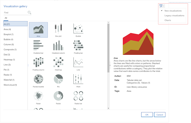 |
| Older version charts are only visible if you click on this little icon on the top right corner of the dialog |
For example, with Column Visualization, it is not possible to add a Trend Line, Base Line or Group Small Items. These are the standard features of the old Column Chart component. If appearance is the only reason to use Visualization, in most cases, customizing the old Chart control could make it looks almost indistinguishable to the same chart type in the newer Visualization version, adding the missing functions, on the other hand, is a lot more difficult.
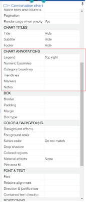 |
| Chart Annotations option is only available in the older version “Chart” control |
When I had to add a Trend Line to a Column Bar Visualization, it took me hours trying to find the “Chart Annotations” section in the Properties navigation bar. This section is not available with the new Visualization. Took me many hours more trying to search and download the “legacy Cognos chart” libraries to import them to my Cognos environment. Only by then, I found out about the little “Filter” button on the corner of the Select Visualization screen to make the old Charts visible. I think IBM could do a few things to improve it:
- Make old components more visible by showing them in the same list, under a separate group (e.g. Cognos v10 charts, Legacy Visualizations, etc.
- Standardize the Properties list of all charts, any properties that are not available to certain chart type could be greyed out, (rather than not shown), and having a tooltip telling users why it is not available
- New chart types or should provide the same minimum functionalities as the older version it tries to replace.
Gotcha #3: Report vs Active Report vs Dashboard
Report, Active Report, Dashboard are totally different things, and use different
underlying technologies, I get it. But on the surface, they have controls with
the same meaning to the end-users/developers such as List, or CrossTab, or
Chart. The problem I have with this one is, when designing a report for
example, the UI looks kind of the same (which gives us the impression that they
are the same), but with some random inconsistencies that confuse the hell out
of those who are new to the product. For example, a (Static) Report can only have
List control, an Active Report can have a List control and a Data List control.
The latter is advertised as a better and faster version. So why not use it to
replace the old ones? (I guess there are limitations which make the old control
irreplaceable but at this point, but I haven’t figured out. As always, IBM will
not tell us, we’ll have to figure it out ourselves the hard way).
Next is the fun part, I needed to display a List with a little graphical like the image
below, and I read somewhere that, in Cognos, we can include a Microchart in the
List to achieve that.
below, and I read somewhere that, in Cognos, we can include a Microchart in the
List to achieve that.
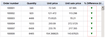 |
| This tiny graphical icon is called a Microchart |
After spending a ridiculous amount of time, turned out this simple feature is only
available in Active Report, with the Data List control (not List).
available in Active Report, with the Data List control (not List).
This Microchart function, in turn, has its own gotcha. For a Data List in Active Report, the Microchart Option can be located on the Property side navigation bar.
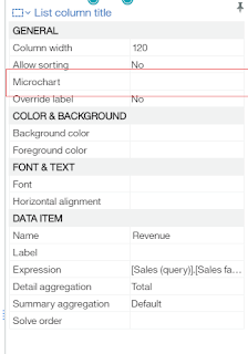 |
| For Data List, Microchart option sits on the Property bar. |
For a CrossTab control, which is available in both Static and Active Report, to add a Microchart, we will have to right click on the Column or Cell, click on the ellipsis icon […] of the On-demand Toolbar, then find the “Insert Chart…”
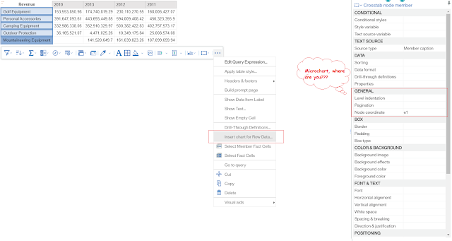 |
| For Crosstab, Microchart option is buried in the […] button of the On-Demand tool bar |
I found few dozen other little annoyances with Cognos, but it all comes down to one thing, consistency, or the lack of it at both business and software design level that make the software so difficult to use. However, to be fair, I think in this
version (v11), IBM has done a great job modernizing Cognos and switching it to
web-based GUI. When a software has a new version, it is always received with criticisms due to changed design and interface. But overtime, people will get used to it or found way to work around limitations, or the vendor found ways to improve it. With Cognos, I’m kind of optimistic thinking about its future.


